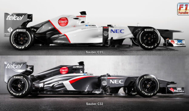
Comparison between Sauber C31 & C32 F1 car

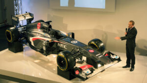
Sauber revealed the C32 today. So it's time for us to look at the changes they did on their 2013 F1 car compared to their old C31 2012 car.
The first big change is off course the changed color scheme. The old car color was already quite nice, but looked a bit simple, for one of the fastest cars in the world.
Looking at the Sauber C32 side view comparison, we noticed that the photos are made with a different camera lens, which makes a good comparison difficult. Although we noticed the following changes:
- Different and longer (at the back) engine cover.
- Nose cover like Ferrari and McLaren.
- Exhaust is lower and differently shaped.
- Shape of the side-pods and engine cover has a very beautiful curve that starts straight at the Telmex logo and stays much higher then the old car.
When we look at the Sauber C32 front view comparison we notice a lot more changes. The biggest change is clearly the side-pods. They have very different shaped air take in and look a lot smaller but higher at the end.
The nose cone on the side view didn't show the old bump, but it's more or less still there. The nose also is fitted with camera's like the Red Bull RB8 has. The front and back wing didn't change much, but have minor detail differences.
Because of the changed side pods the car looks very different then it's predecessor. If it's quick? We will see next week during the first winter testing sessions in Jerez (Spain).
✅ Check out more posts with related topics:


LAST 3 F1 Fan COMMENTS